Orion Movers logo design case study · Relocation
Moving Forward.
In Perfect Orbit.
Your peace of mind, packed and delivered
How we gave Orion Movers, a relocation company for families and businesses, a logo and brand system that turns the stress of moving into the calm of a fresh start.
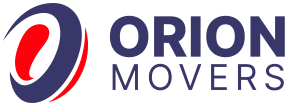
Orbit + pulse · Clear space = x
#393769
Client
Orion Movers
Industry
Relocation · Logistics
Deliverables
Logo · Brand guide · Applications
Project
New brand identity
The brief
Make moving feel like a fresh start, not a stressful day.
Orion Movers helps families and businesses relocate through expert logistics, modern technology and a culture of radical accountability. Moving is one of life’s most stressful events, and most movers look it: crowded trucks, piled-up boxes and dated logos. Orion needed a brand that feels calm, premium and always moving forward.
The Challenge
- Moving is stressful, and most mover brands feel cluttered
- A category full of trucks, boxes, houses and arrows
- Had to win the trust of both families and businesses
What Success Looked Like
- Feels calm, premium and trustworthy
- Shows forward momentum even when it stands still
- Bold on trucks and billboards, crisp as a favicon
- Owns a clear navy-and-red system
Mission & values
Built on a Clear Purpose
“To deliver seamless, stress-free moving experiences through expert logistics, modern technology, and a culture of radical accountability.” Every part of the identity was designed to express that mission.
01
Precision
In a world of centimetres and seconds, Orion never misses a mark.
02
Stewardship
Your assets and the planet are treated as if they were Orion’s own.
03
Transparency
Real-time tracking and open communication are the standard, not an add-on.
04
Agility
From changing demands to complex facility moves, Orion pivots at the speed of your needs.
The vision: to be India’s leading relocation partner, setting the benchmark for how families and businesses move forward with absolute ease.
Why it matters
A Mover’s Logo Never Stays in One Place.
A relocation brand rides on trucks, cartons, tape, uniforms, billboards and booking screens, often seen in motion and from a distance. Families hand over everything they own. The logo has to look dependable at a glance, stay sharp in one colour on a box, and still feel premium on a website.
01sec
First Impression
All the time a family gives a passing truck to remember the name.
16px
Still Readable
From the side of a truck down to a browser tab.
01colour
Still Yours
On cartons, tape and one-colour print.
10+yrs
Still Relevant
Designed to grow with the brand, not chase trends.
From brief to brand
One Orbit. One Pulse. One Mark.
Discover
We worked with the founders to define Orion’s promise: seamless, stress-free moves for families and businesses. Four values became our filter for every idea: precision, stewardship, transparency and agility.
Research
We reviewed packers, movers and logistics brands. Most used trucks, cardboard boxes, houses and arrows, so they looked alike and felt like hard work.
Sketch
Explorations around the name Orion, constellations, orbits, paths and motion, all chasing one idea: a smooth transition from where you are to where you want to be.
Explore
Directions tested on trucks, cartons and favicons from day one. A navy orbit with a red pulse told the full story and stayed bold at every size.
Refine
We weighted the mark to the right so it pulls the eye forward, tuned the pulse’s angle for momentum, and paired it with a bold, spaced ORION MOVERS wordmark.
Deliver
Master logo, sub mark, mono and reversed versions, plus a full brand guide: colour, Manrope typography, icons, patterns, image style, social templates and mockups.
Behind the scenes
The Ones That Didn’t Make It
Good ideas get cut too. Here’s what we set aside, and why.
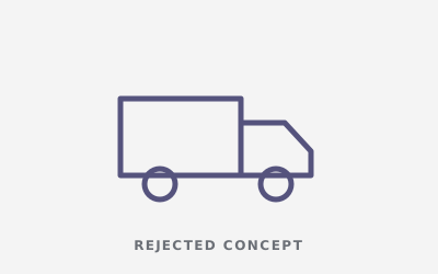
The Moving Truck
Literal and instantly clear, but used by almost every mover.
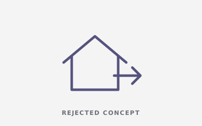
The House + Arrow
Says “relocation”, but it felt like a property brand.
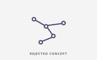
The Orion Constellation
True to the name, but too abstract and hard to read when small.
Every detail has a job
Every Curve Carries Meaning
1
The Navy Orbit
The secure path. A deep blue ring for stability and care: the safe structure that protects your world while it’s in Orion’s hands.
2
The Red Pulse
The power of progress. A vibrant red curve, a trail of momentum that shows Orion is always moving you forward.
3
The Forward Pull
The logo is weighted to the right, so even on a static sign it leads the eye towards the next destination.
4
The Wordmark
A bold ORION over a spaced MOVERS: confident and readable on a truck, a carton or a phone screen.
Construction & rules
Built on Rules, Not Guesswork.
Clear rules keep the identity consistent on trucks, cartons, uniforms, billboards, the website and every social post.
Construction Grid
The orbit and pulse sit on a rotated ellipse grid, and the sub mark sets the height of the wordmark, so the logo stays balanced at every size.
xxxxClear Space
Keep a margin of x (the height of the “O”) on every side. Nothing enters this zone.
48px32px24px minMinimum Size
24px on screen and 15mm in print. Below that, use the symbol on its own.
Stress tests
Tested in the Real World Before Launch.
A logo that only works on a big white screen isn’t finished. We put Orion Movers through the places it actually lives before the client ever did.
 Orion Movers · Book a move
16px Favicon
The orbit-and-pulse sub mark still reads in a crowded row of browser tabs.
App & Social Icon
The sub mark alone stands out on a home screen or as a profile picture.
One Colour
Works on cartons, tape and single-colour print.
Reversed
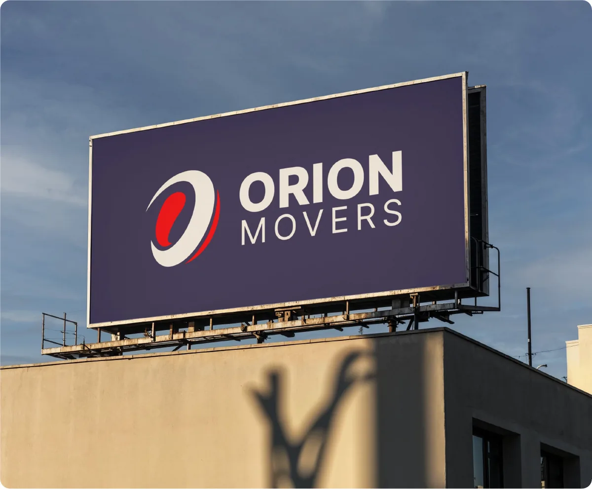
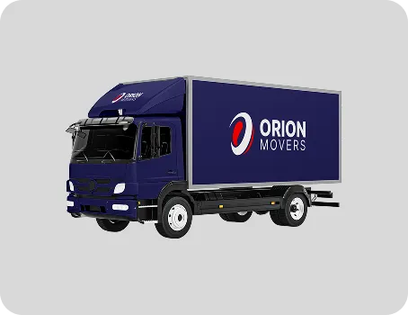
Holds up on navy trucks, uniforms and dark backgrounds.
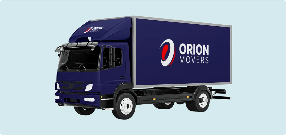
On Vehicles
Bold and readable on the side of a moving truck.
Hover to sharpenSquint Test
Still recognisable when blurred, the classic memorability check.
Brand identity system
One Identity. Every Place it Shows up
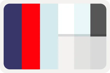
Orion Navy
#393769
Kinetic Red
#FF000C
Sky Blue
#D4EBEE
Soft Blue
#E9F7FA
Slate Grey
#565656
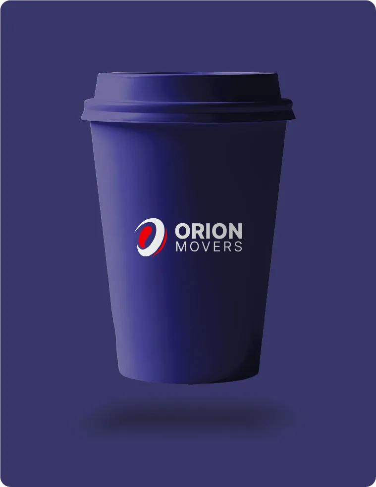
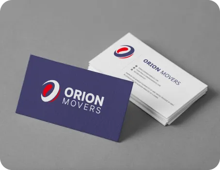
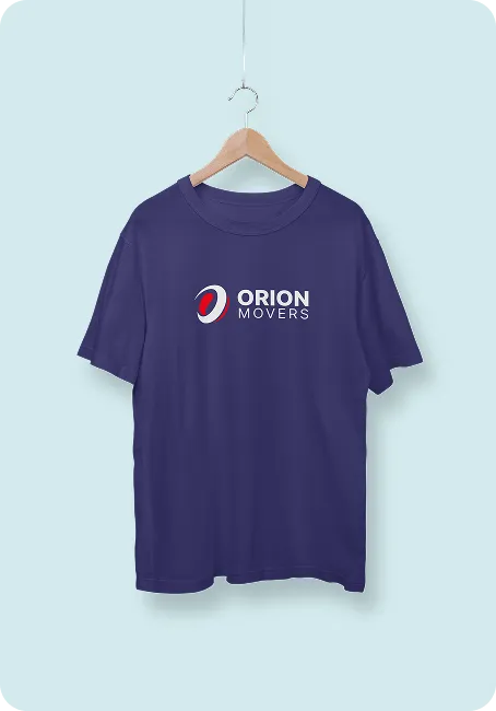
Brand toolkit
A Complete System, Not Just a Logo
Every element of the brand guide grows from the Orion mark, so the identity stays consistent on every screen, sign and surface.
Iconography
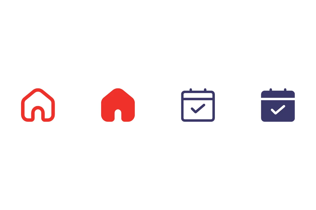
Mono line icons for apps and guides, filled icons for signage and safety labels. Never boxed: they breathe in open space.

The Kinetic Path
Parallel lines tilted at the angle of the Red Pulse, used at 5–15% opacity to add depth without noise.
The Stellar Grid
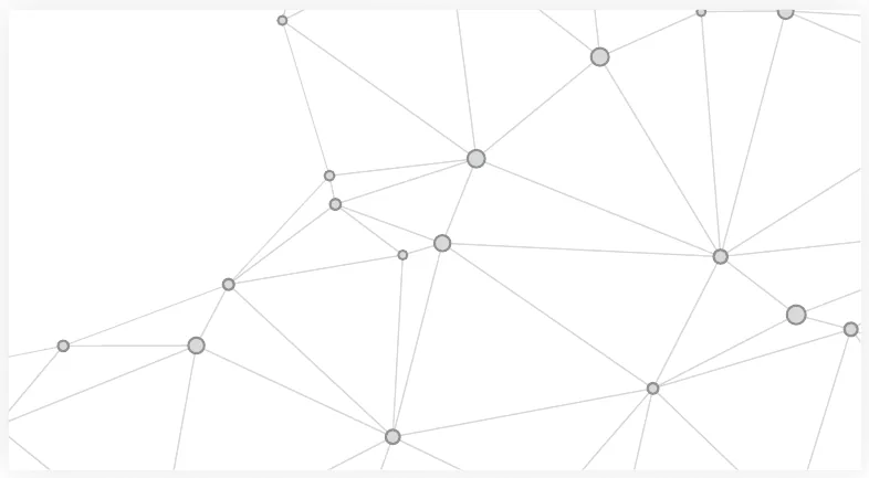
A blueprint-style grid of connected points that reflects precise planning and inventory systems.

Image Style
“The Bright Transition”: clean, left-to-right compositions with open space. No stress, no gritty filters.
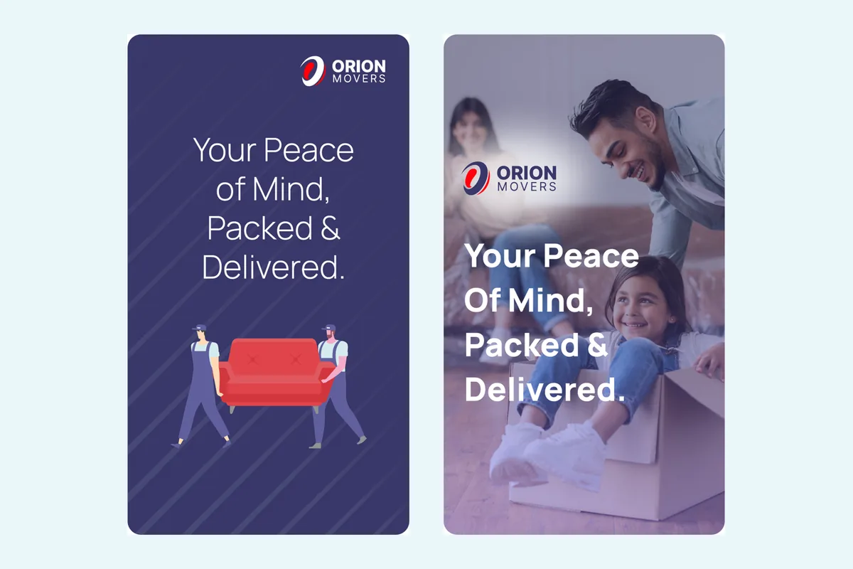
Social Media
Navy-led “Momentum” posts with bold Manrope headlines, a pop of Kinetic Red and left-to-right motion.
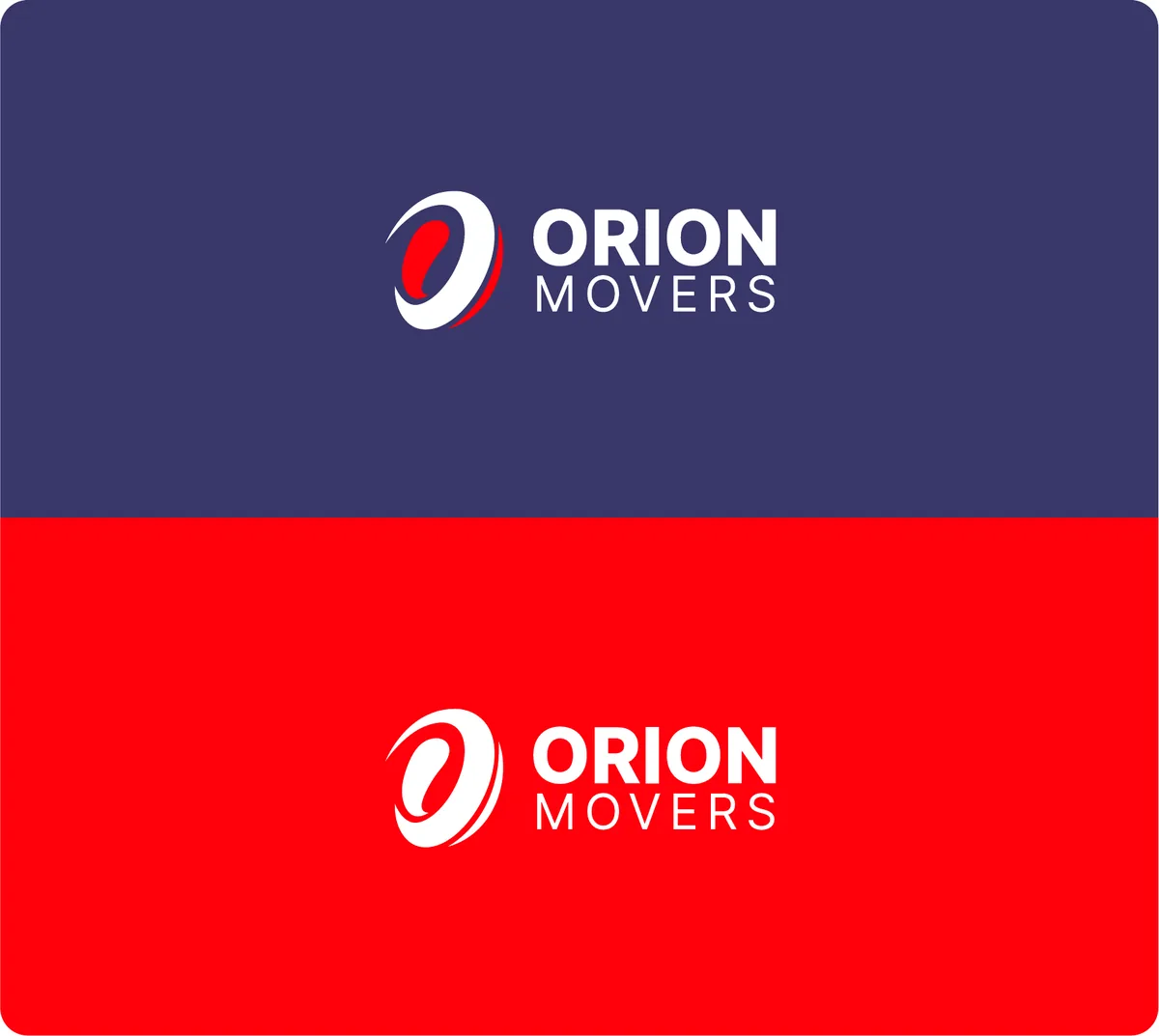
Alternate Backgrounds
High-contrast versions for navy and red backgrounds, so the logo never feels lost or muted.
The result
What the New Identity Delivers
1+1
One navy orbit and one red pulse: stability and momentum in a single mark.
60/30/10
Navy, white and Kinetic Red in a fixed ratio, so every layout feels like Orion.
1
Brand system across trucks, cartons, uniforms, billboards, web and social.