Break a take brand Logo Design Case Study
Break a Take Logo Design — Brewing a Warm, Vintage Coffee Brand Identity
Crafting a Cozy, Readable Identity Rooted in Warmth and Simplicity
Designing a Vintage Coffee Logo That Invites People to Take a Break
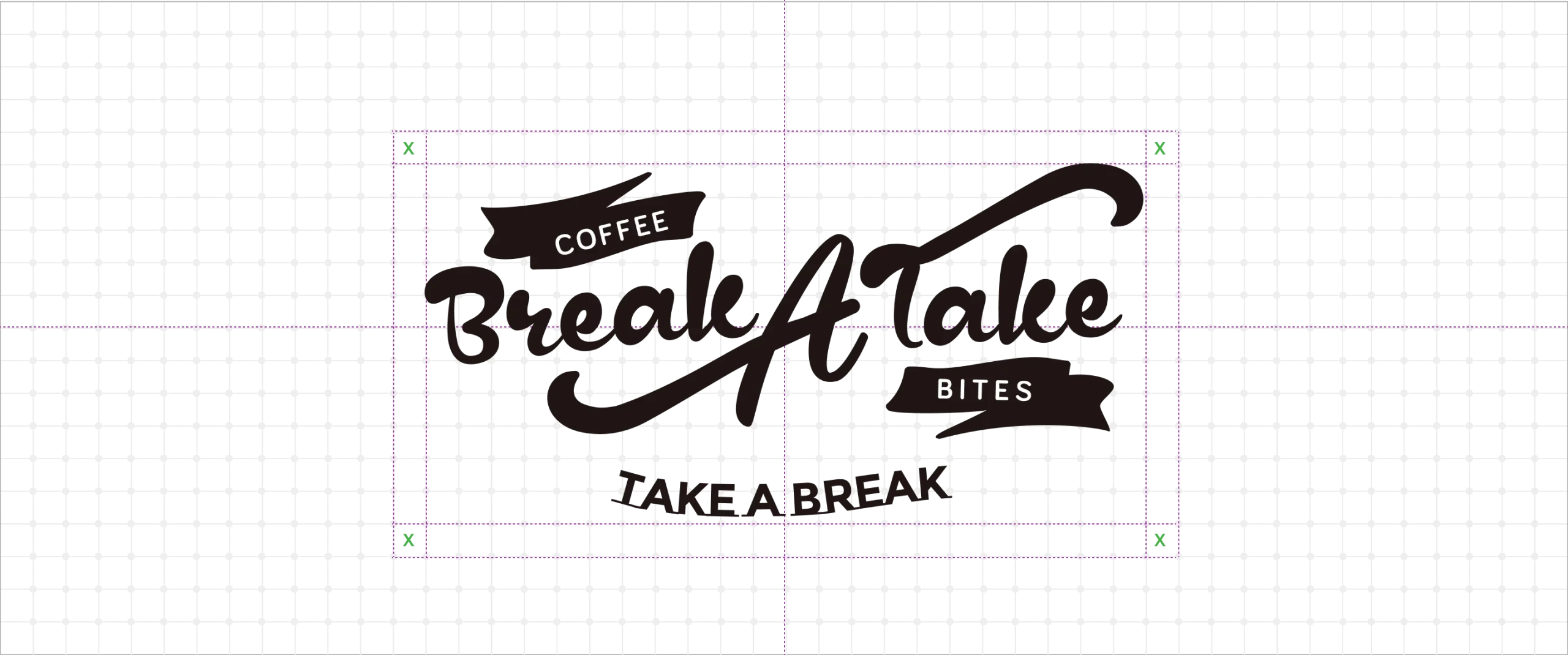
Break a Take is a cozy hangout coffee joint known for quick bites, great coffee, and relaxed vibes. The name itself is a playful twist on “Take a Break,” inspiring a logo that feels inviting and familiar.
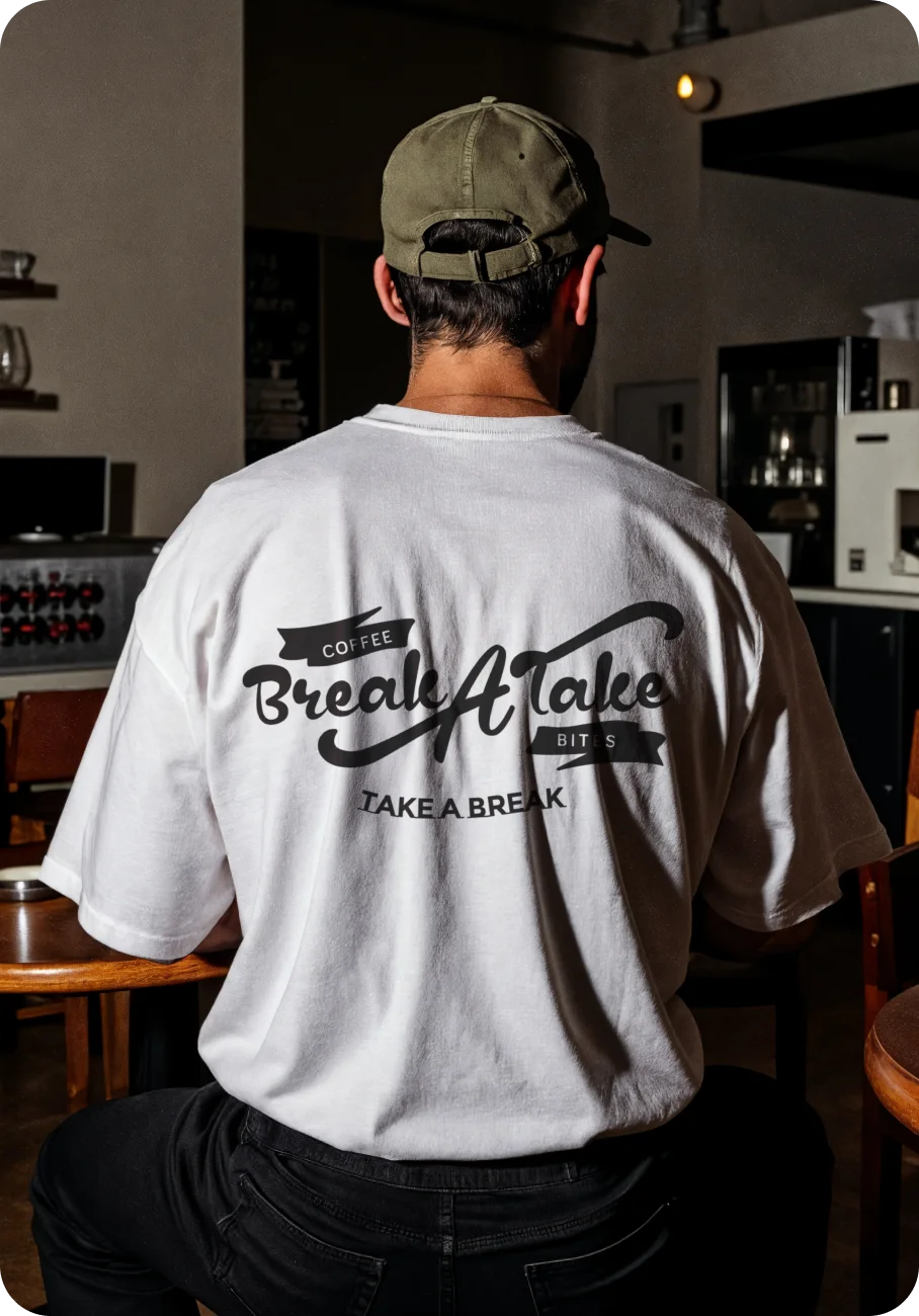
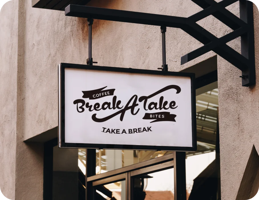
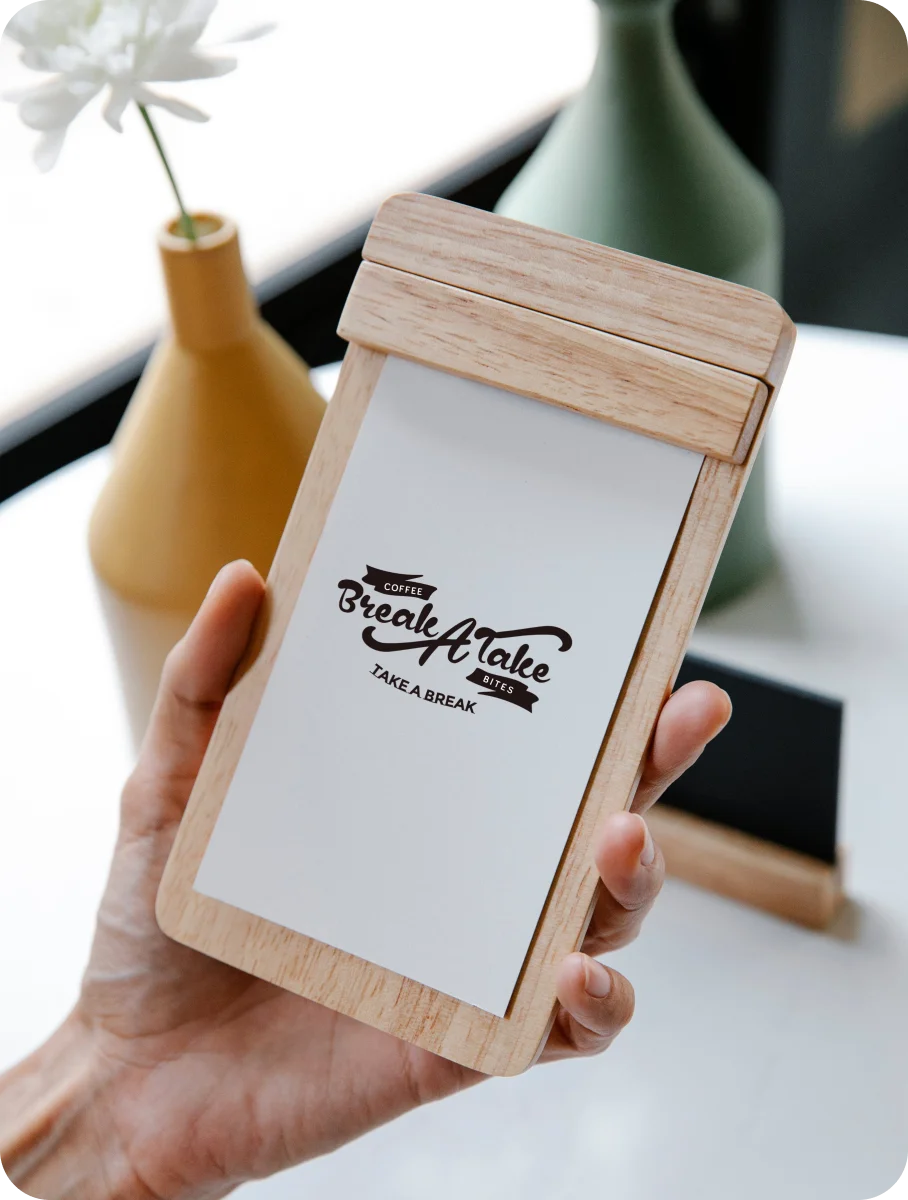
The brand mark features rich coffee-brown tones and stylized vintage lettering — evoking warmth, nostalgia, and authenticity. With no additional symbols, the design keeps focus on the brand name, ensuring ultra readability across signage, packaging, and digital menus.
The classic aesthetic and earthy palette connect directly with coffee enthusiasts, creating a memorable identity that blends comfort, creativity, and timeless appeal. This logo design perfectly captures the spirit of taking a well-deserved break — one sip at a time.
Your Brand Logo Journey starts here Get started →
Break A Take — A Playful Identity for a Snack-on-the-Go Brand
A bright, appetizing logo that evokes fun, freshness, and the joy of quick, tasty indulgence.
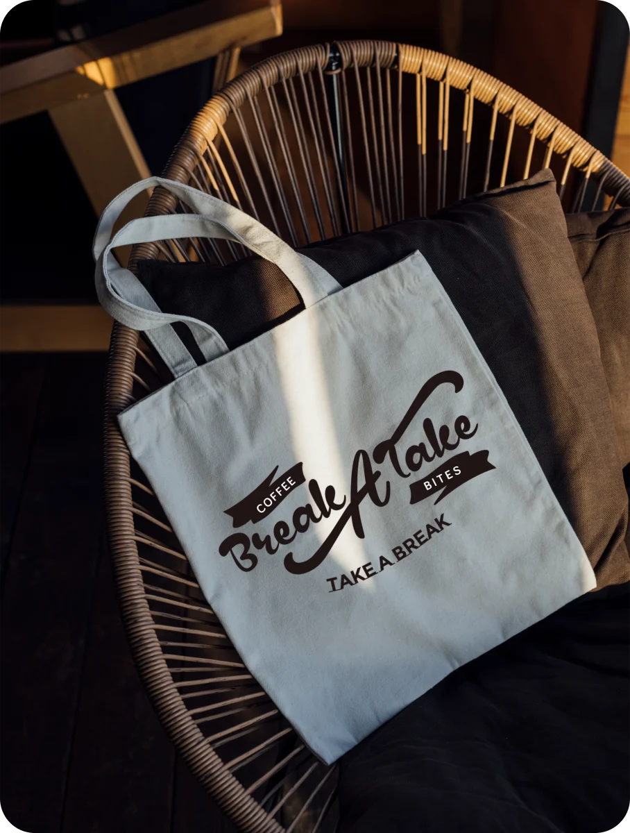
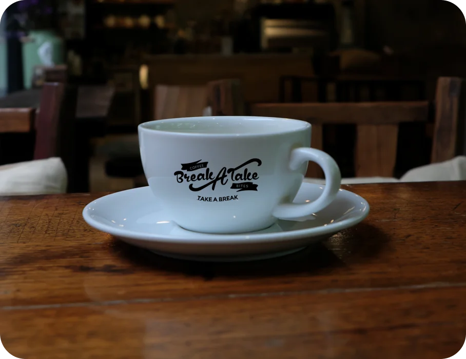
Showcasing the Color Palette, Typography, and Real-World Brand Applications by Design Agency CGAlive
Break a Take Brand Identity — Vintage Fonts, Coffee Browns & Mockups

More Professional Logo Design Case Studies & Brand Identity Projects
Curated Collection of Case Studies Highlighting Creativity, Precision, and Purpose in Brand Identity Design.Entity
Hema Agrotech logo
Hema Agrotech — Nurturing Growth, Naturally
Roboto 360 logo
Roboto 360 — Humanizing Automation
Woodie Woodie logo
Woodie Woodie — Strength with Wisdom
CREATE A BRAND THAT LASTS
From Brand Logo To Identity, We Design It
With A Great Story
Unique, memorable logo and brand design that leaves a lasting impression.


