Courier Abroad brand Logo Design Case Study
Crafting a Dynamic Logo That Symbolizes Speed and Global Reach
A logistics logo design and visual identity built for speed and reliability
Courier Abroad — Delivering Speed with Precision
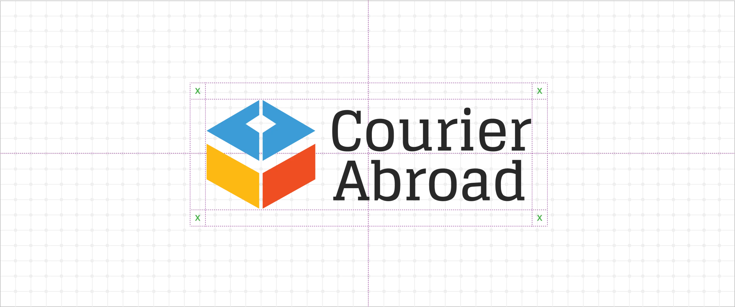
The logo features a 3D box symbol, representing movement, delivery, and trust. The blue conveys professionalism and dependability, yellow adds warmth and optimism, while orange captures energy and speed — together forming a vibrant, dynamic palette that mirrors global connectivity.
Clean lines and subtle depth give the mark a sense of motion, symbolizing parcels in transit and the company’s seamless service. The result is a bold, contemporary identity that makes Courier Abroad instantly recognizable — a brand built for speed, trust, and cross-border simplicity.
Your Brand Logo Journey starts here Get started →
Courier Abroad — Delivering Speed with Precision
Courier Abroad — Delivering Global Speed Through Design
A 3D box in motion captures agility, energy, and trust. Explore how color and depth create a brand built for fast global deliveries.

More Professional Logo Design Case Studies & Brand Identity Projects
Curated Collection of Case Studies Highlighting Creativity, Precision, and Purpose in Brand Identity Design.Entity
Hema Agrotech logo
Hema Agrotech — Nurturing Growth, Naturally
Roboto 360 logo
Roboto 360 — Humanizing Automation
Woodie Woodie logo
Woodie Woodie — Strength with Wisdom
CREATE A BRAND THAT LASTS
From Brand Logo To Identity, We Design It
With A Great Story
Unique, memorable logo and brand design that leaves a lasting impression.


