Roboto 360 brand Logo Design Case Study
Humanizing IT Automation Through Friendly, Futuristic Design
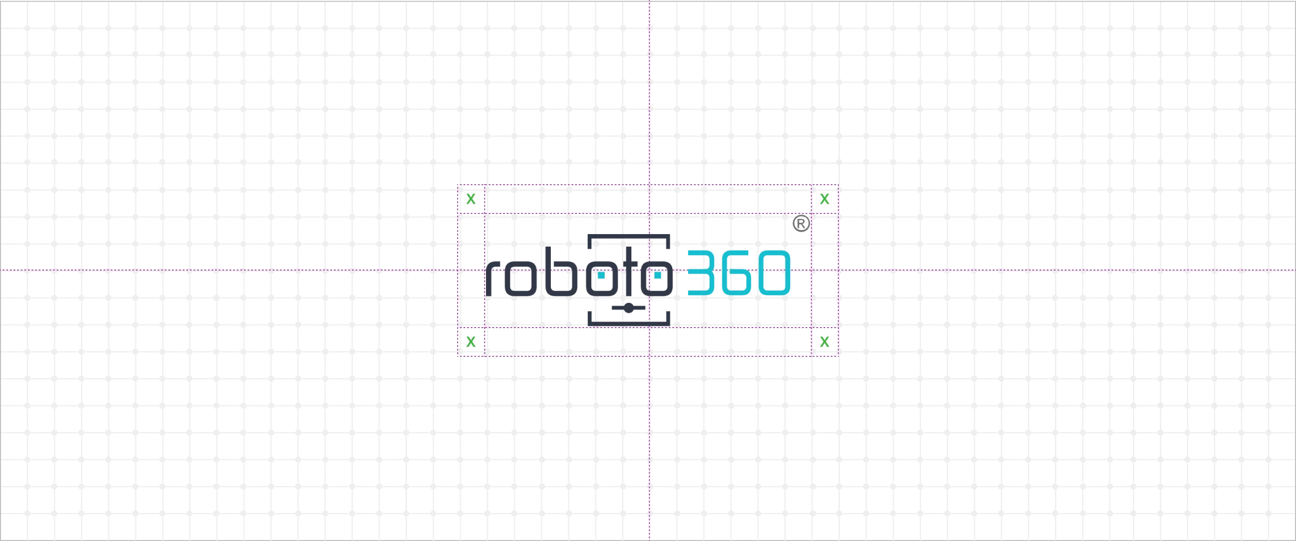
A technology logo design that balances innovation with human-centered branding
Roboto 360 — Humanizing Automation
Roboto 360, a tech startup specializing in IT automation, needed a logo that blends innovation with approachability. The goal was to design an identity that feels futuristic yet friendly — reflecting technology that simplifies, not intimidates.
The logo integrates a robotic character subtly formed within the last three digits of the word-mark of “Roboto”, symbolizing completeness, adaptability, and continuous improvement. The teal blue conveys intelligence and innovation, while dark grey adds sophistication and reliability. Together, they balance modern technology with human warmth.
The design’s charm lies in its simplicity — a friendly face hidden in a sleek, corporate form. The result is a memorable logo that makes automation feel accessible, positioning Roboto 360 as a forward-thinking brand making IT smarter, smoother, and more human.
Your Brand Logo Journey starts here Get started →
Roboto 360 — Humanizing Automation
A technology logo design balancing innovation with a human-centered approach.
Roboto 360 — Making IT Automation Feel Human and Smart
A friendly robot hidden within a sleek wordmark. Learn how design and color balance innovation with approachability.

More Professional Logo Design Case Studies & Brand Identity Projects
Curated Collection of Case Studies Highlighting Creativity, Precision, and Purpose in Brand Identity Design.Entity
Hema Agrotech logo
Hema Agrotech — Nurturing Growth, Naturally
Woodie Woodie logo
Woodie Woodie — Strength with Wisdom
Courier Abroad logo
Courier Abroad — Delivering Speed with Precision
CREATE A BRAND THAT LASTS
From Brand Logo To Identity, We Design It
With A Great Story
Unique, memorable logo and brand design that leaves a lasting impression.

