24 by 7 Courier brand Logo Design Case Study
24by7 Courier Logo Design — Building a Fast and Reliable Brand Identity
Crafting a Clean, Reliable Logo That Reflects Speed and Service
Designing a 24-Hour Identity for a Dynamic Logistics Brand
24by7 Courier is a young, dynamic logistics brand committed to delivering efficiency around the clock. The goal was to create a logo that instantly communicates speed, reliability, and trust.
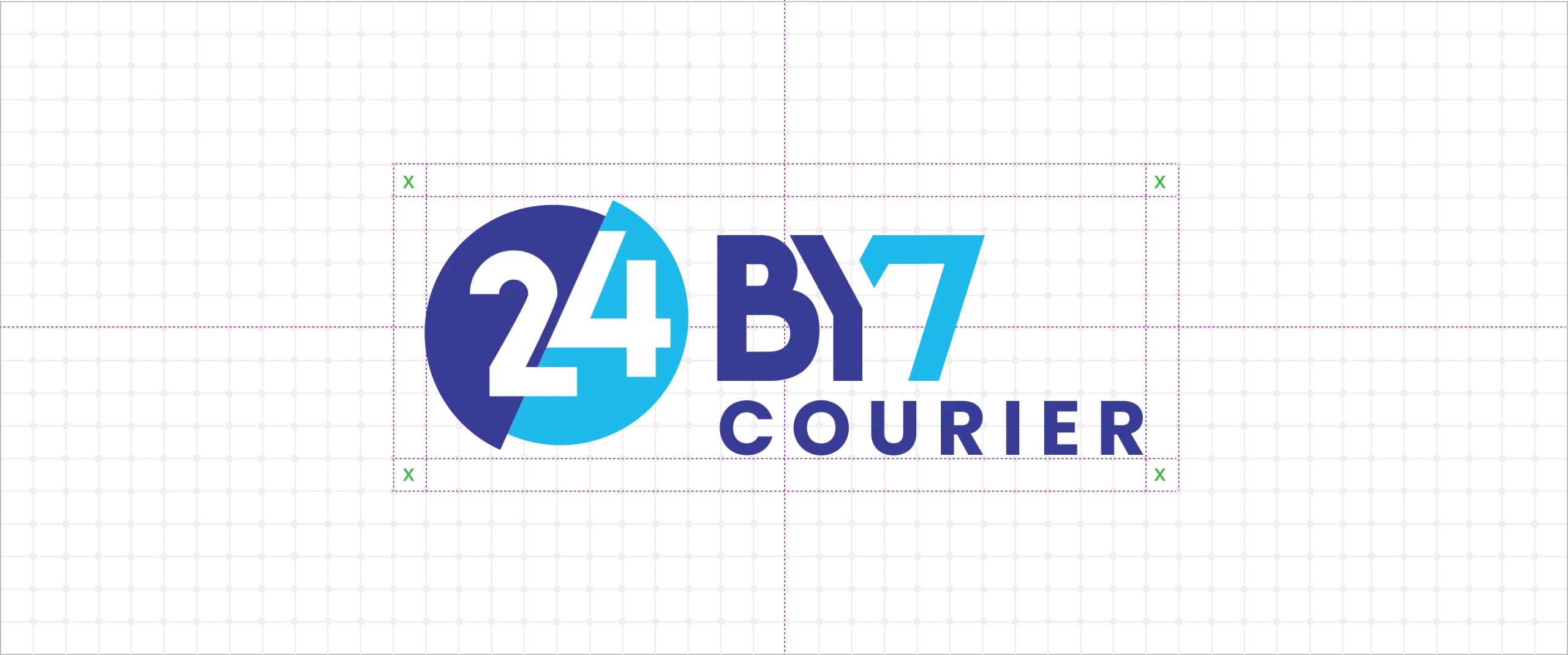
The final design features a circular emblem with two shades of blue — representing day and night service — paired with bold, stylized typography. This clean, symbol-free design ensures instant legibility across delivery trucks, uniforms, and digital interfaces.
The dual-tone color palette conveys movement and continuity, while the confident font reflects precision and professionalism. Together, these elements form a timeless, modern identity that embodies the brand’s promise of uninterrupted service — 24 hours a day, 7 days a week.
Your Brand Logo Journey starts here Get started →
24by7 Courier — Delivering Speed and Reliability Through Design
A dynamic brand identity that reflects nonstop service, precision, and global connectivity in courier logistics.
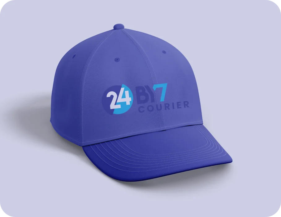
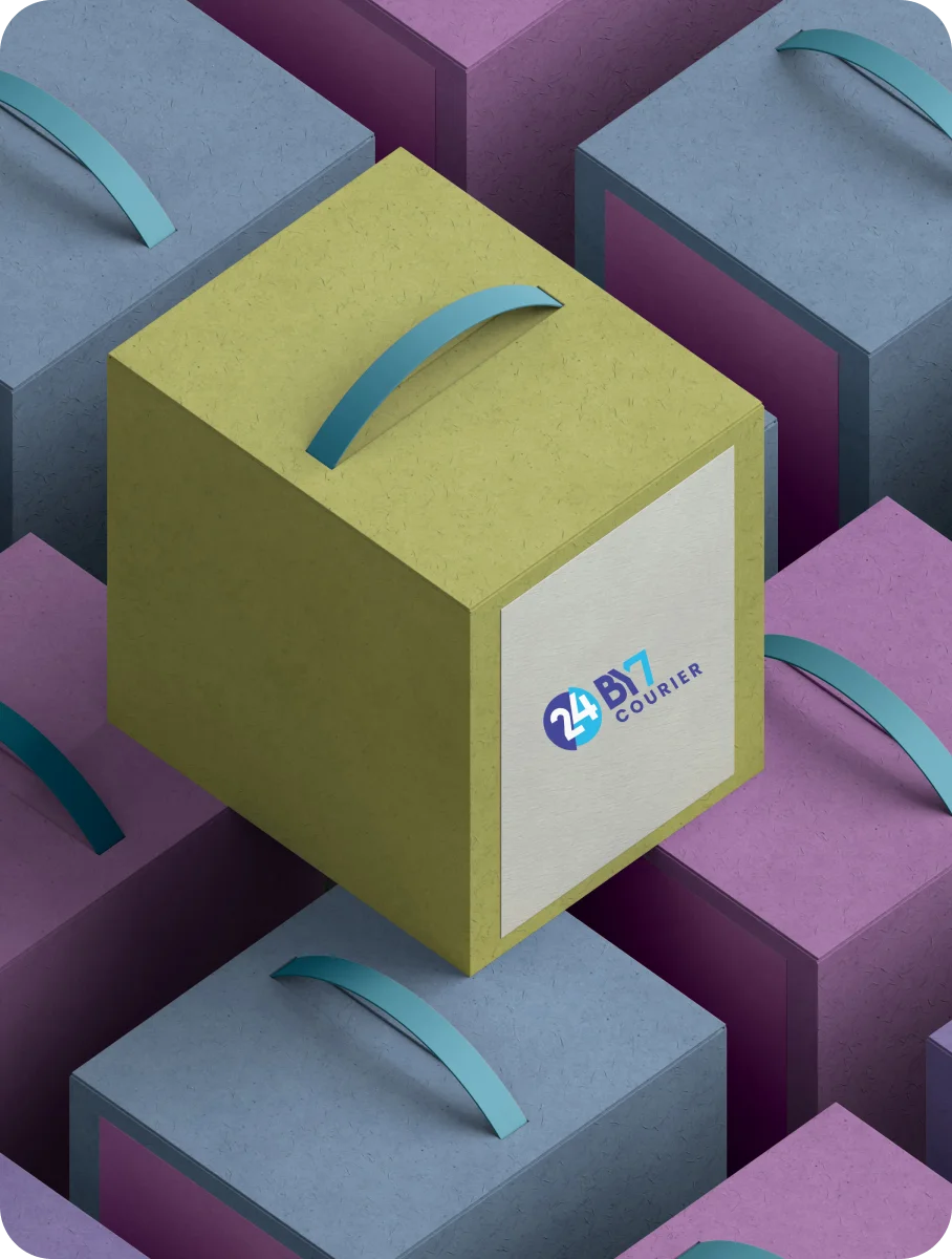
24by7 Courier Brand Identity System — Colors, Typography & Applications by Design Agency CGAlive
Exploring Logo Mockups, Blue Color Palette, and Font Styling

More Professional Logo Design Case Studies & Brand Identity Projects
Curated Collection of Case Studies Highlighting Creativity, Precision, and Purpose in Brand Identity Design.Entity
Hema Agrotech logo
Hema Agrotech — Nurturing Growth, Naturally
Roboto 360 logo
Roboto 360 — Humanizing Automation
Woodie Woodie logo
Woodie Woodie — Strength with Wisdom
CREATE A BRAND THAT LASTS
From Brand Logo To Identity, We Design It
With A Great Story
Unique, memorable logo and brand design that leaves a lasting impression.


