Cloudreboot brand Logo Design Case Study
CloudReboot — Reimagining Cloud Technology Through Intelligent Design

Crafting a Clean, Reliable Logo That Reflects Speed and Service
Designing a 24-Hour Identity for a Dynamic Logistics Brand
CloudReboot, a next-generation tech startup, specializes in enterprise-grade cloud solutions that help businesses scale seamlessly. The challenge was to create a brand identity that captures both innovation and reliability in the digital cloud ecosystem.
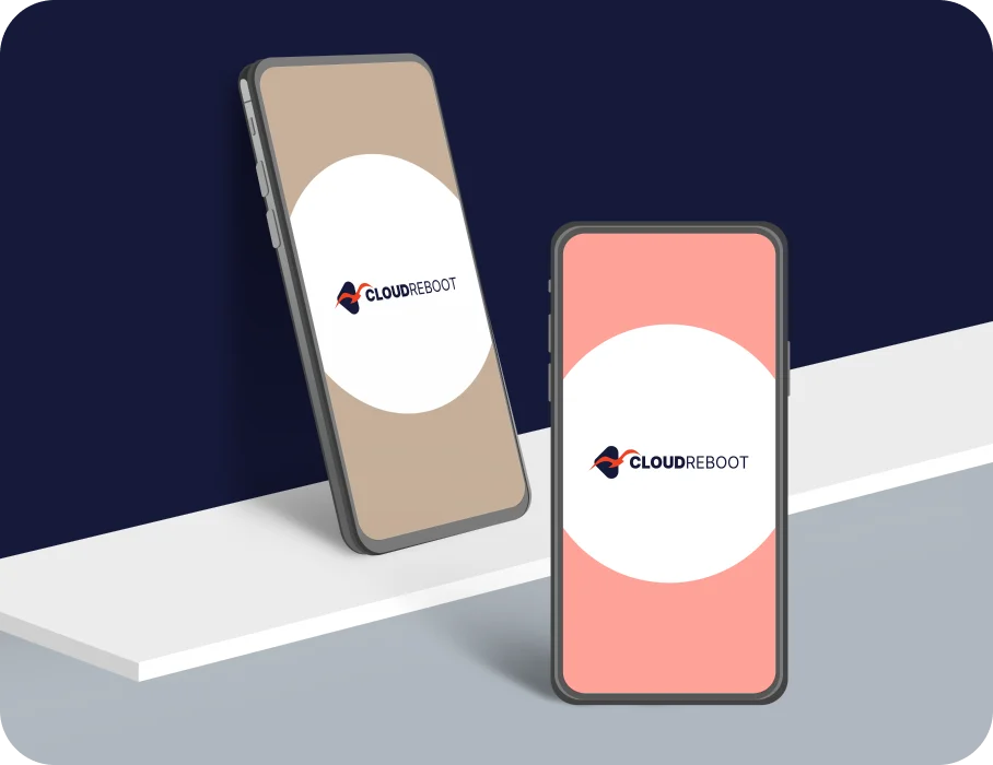
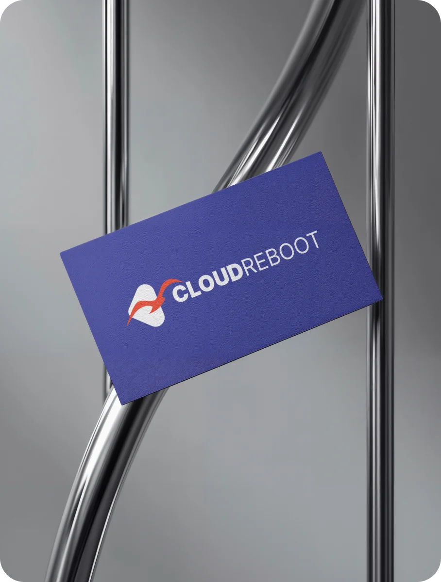
The brand mark features a geometric “C” symbol, designed with minimal lines to resemble both a triangle (representing the cloud) and a bird soaring high — symbolizing freedom, speed, and limitless potential. The color palette of blue and red strikes the right balance between trust, technology, and bold enterprise energy.
This clean, forward-looking logo visually conveys CloudReboot’s mission: empowering businesses to rise above the cloud with agility, security, and smart solutions.
Your Brand Logo Journey starts here Get started →
CloudReboot — Elevating Cloud Innovation Through Intelligent Design
A minimal geometric logo that symbolizes flight, scalability, and enterprise-focused digital transformation.
CloudReboot Brand Identity and Visual Elements by Design Agency CGAlive
Logo Mockups, Font Style, and Color Palette Defining the CloudReboot Brand


More Professional Logo Design Case Studies & Brand Identity Projects
Curated Collection of Case Studies Highlighting Creativity, Precision, and Purpose in Brand Identity Design.Entity
Hema Agrotech logo
Hema Agrotech — Nurturing Growth, Naturally
Roboto 360 logo
Roboto 360 — Humanizing Automation
Woodie Woodie logo
Woodie Woodie — Strength with Wisdom
CREATE A BRAND THAT LASTS
From Brand Logo To Identity, We Design It
With A Great Story
Unique, memorable logo and brand design that leaves a lasting impression.


