Hema Agrotech brand Logo Design Case Study
Cultivating an Organic Brand Identity Rooted in Nature and Care
An agriculture logo design and brand identity inspired by nature and sustainability
Hema Agrotech — Nurturing Growth, Naturally
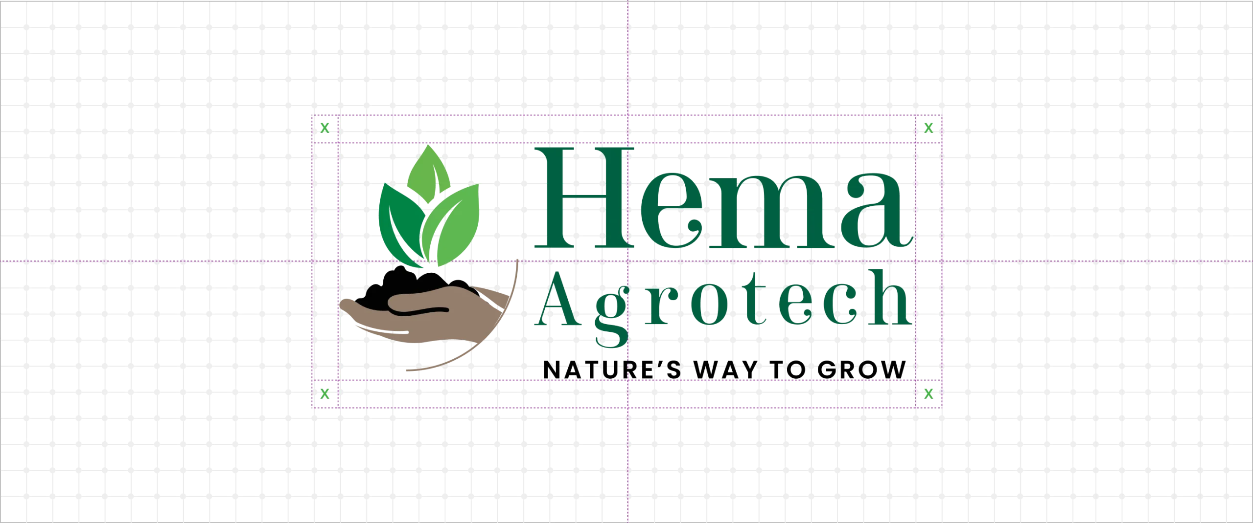
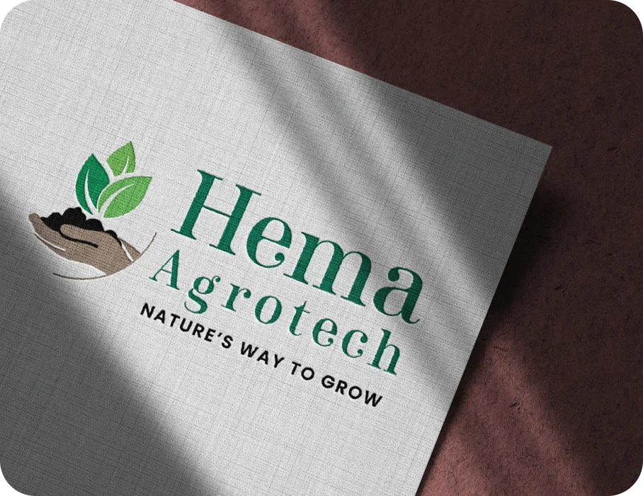
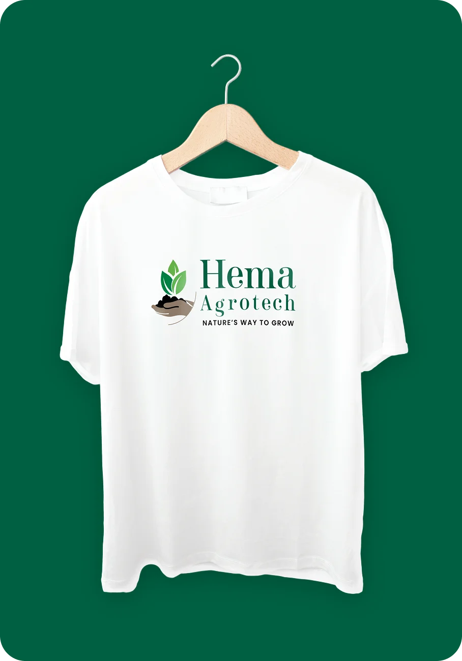
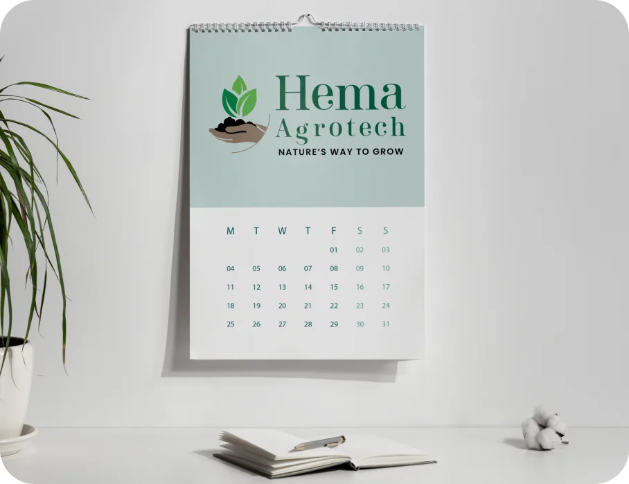
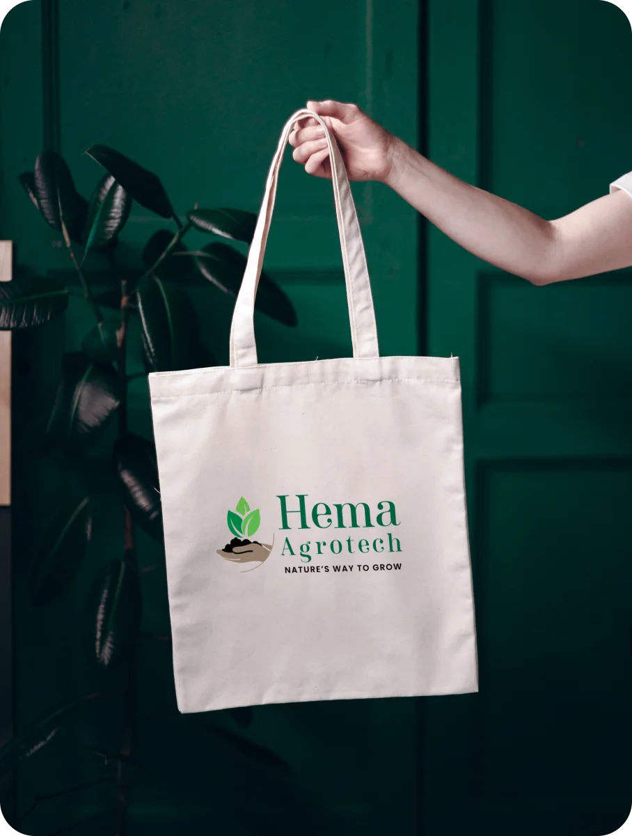
The brand mark features hands gently holding soil with a sprouting plant, symbolizing nourishment, responsibility, and the beginning of new life. The earthy brown reflects the richness of soil and organic origins, while green represents vitality, growth, and renewal. Together, they create a grounded, harmonious palette that connects deeply with nature.
Every curve and detail in the design reinforces the brand’s purpose — to restore balance between people, soil, and planet. The result is a warm, authentic logo that inspires trust and reflects Hema Agrotech’s mission to grow a greener future.
Your Brand Logo Journey starts here Get started →
Hema Agrotech — Nurturing Growth, Naturally
An agriculture brand identity inspired by sustainability, nature, and growth.
Hema Agrotech — Growing Trust Through Natural Design
Hands nurturing soil and a sprouting plant embody sustainability and care. See how organic colors bring the brand’s mission to life.


More Professional Logo Design Case Studies & Brand Identity Projects
Curated Collection of Case Studies Highlighting Creativity, Precision, and Purpose in Brand Identity Design.Entity
Roboto 360 logo
Roboto 360 — Humanizing Automation
Woodie Woodie logo
Woodie Woodie — Strength with Wisdom
Courier Abroad logo
Courier Abroad — Delivering Speed with Precision
CREATE A BRAND THAT LASTS
From Brand Logo To Identity, We Design It
With A Great Story
Unique, memorable logo and brand design that leaves a lasting impression.


