IC-IT brand Logo Design Case Study
Creating a Modern Wordmark that Reflects Precision and Professionalism
Minimalist logo design and branding that define clarity and precision
IC-IT — Where Precision Meets Modern Simplicity
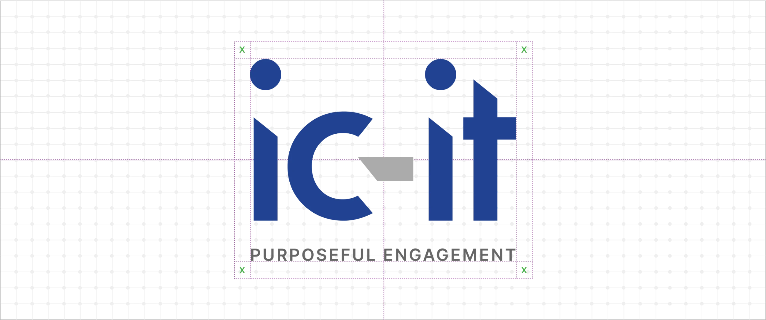
IC-IT, a technology solutions company, wanted a timeless wordmark that reflected intelligence, clarity, and professionalism. The goal was to design an identity that communicates confidence without relying on complex graphics — a mark that speaks through balance and detail.
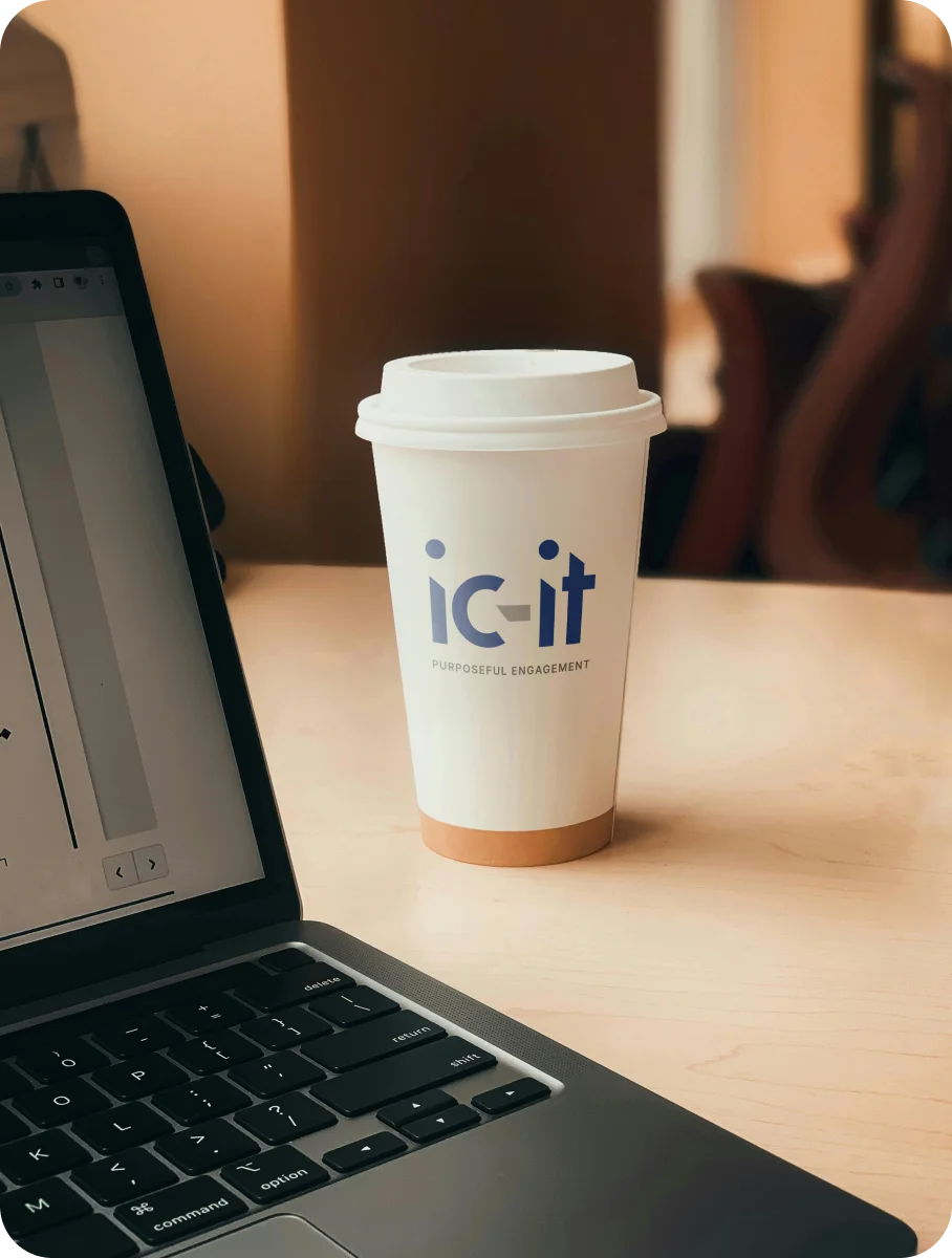
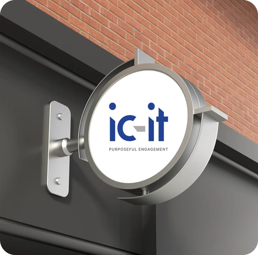
We crafted a custom wordmark where each letter mirrors the brand’s values: clean, structured, and forward-looking. The subtle interplay between sharp and rounded edges adds a human touch to its technical essence. The navy blue and grey palette reinforces trust, stability, and modernity — qualities that define IC-IT’s approach to technology.
What makes this logo stand out is the restraint — every curve and spacing decision was made with intent. The result is a wordmark that’s understated yet powerful, evoking curiosity through its refined simplicity and strategic precision.
Your Brand Logo Journey starts here Get started →
IC-IT — Where Precision Meets Modern Simplicity
A minimalist logo design that blends clarity, control, and modern sophistication.
IC-IT — Designing a Modern Wordmark That Reflects Precision
A minimalist identity built on clarity and confidence. See how we created a timeless wordmark that communicates intelligence and trust.


More Professional Logo Design Case Studies & Brand Identity Projects
Curated Collection of Case Studies Highlighting Creativity, Precision, and Purpose in Brand Identity Design.Entity
Hema Agrotech logo
Hema Agrotech — Nurturing Growth, Naturally
Roboto 360 logo
Roboto 360 — Humanizing Automation
Woodie Woodie logo
Woodie Woodie — Strength with Wisdom
CREATE A BRAND THAT LASTS
From Brand Logo To Identity, We Design It
With A Great Story
Unique, memorable logo and brand design that leaves a lasting impression.


