TeaCares Foundation brand Logo Design Case Study
TeaCares Foundation — A Heartwarming Logo Redefining Care and Joy in Education

Crafting a Compassionate Identity for a Literacy-Driven NGO
TeaCares Foundation Logo Redesign Reflecting Joy and Literacy Empowerment
The TeaCares Foundation, a dedicated NGO focused on improving literacy among underprivileged children, needed a logo that reflects compassion, hope, and happiness.
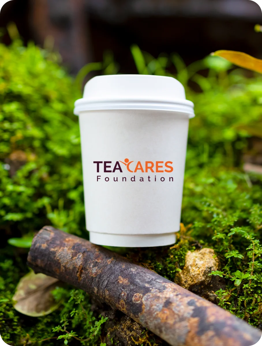
The new TeaCares Foundation logo design captures these emotions through a simple yet powerful visual — a joyful child spreading their hands in a gesture of delight, forming the letter “C” for Care. The vibrant orange color palette highlights warmth, optimism, and the spirit of nurturing young minds.
Designed to be memorable and empathetic, the logo brings together the essence of childlike joy and the foundation’s mission of empowerment through education. This rebranding gives TeaCares Foundation a refreshing, emotionally resonant identity that connects instantly with donors, volunteers, and communities alike.
Your Brand Logo Journey starts here Get started →
TeaCares Foundation — Brewing a Symbol of Hope and Compassion
A meaningful logo design that connects wellness, community, and care through soothing visual storytelling.
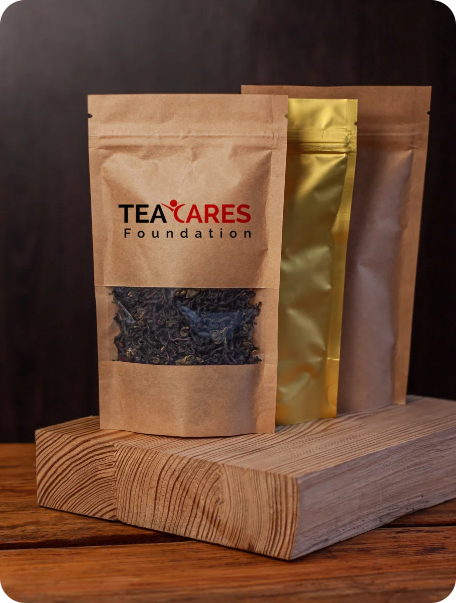
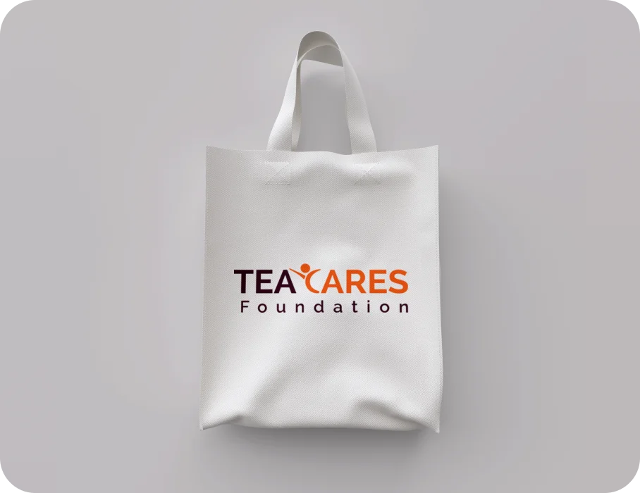
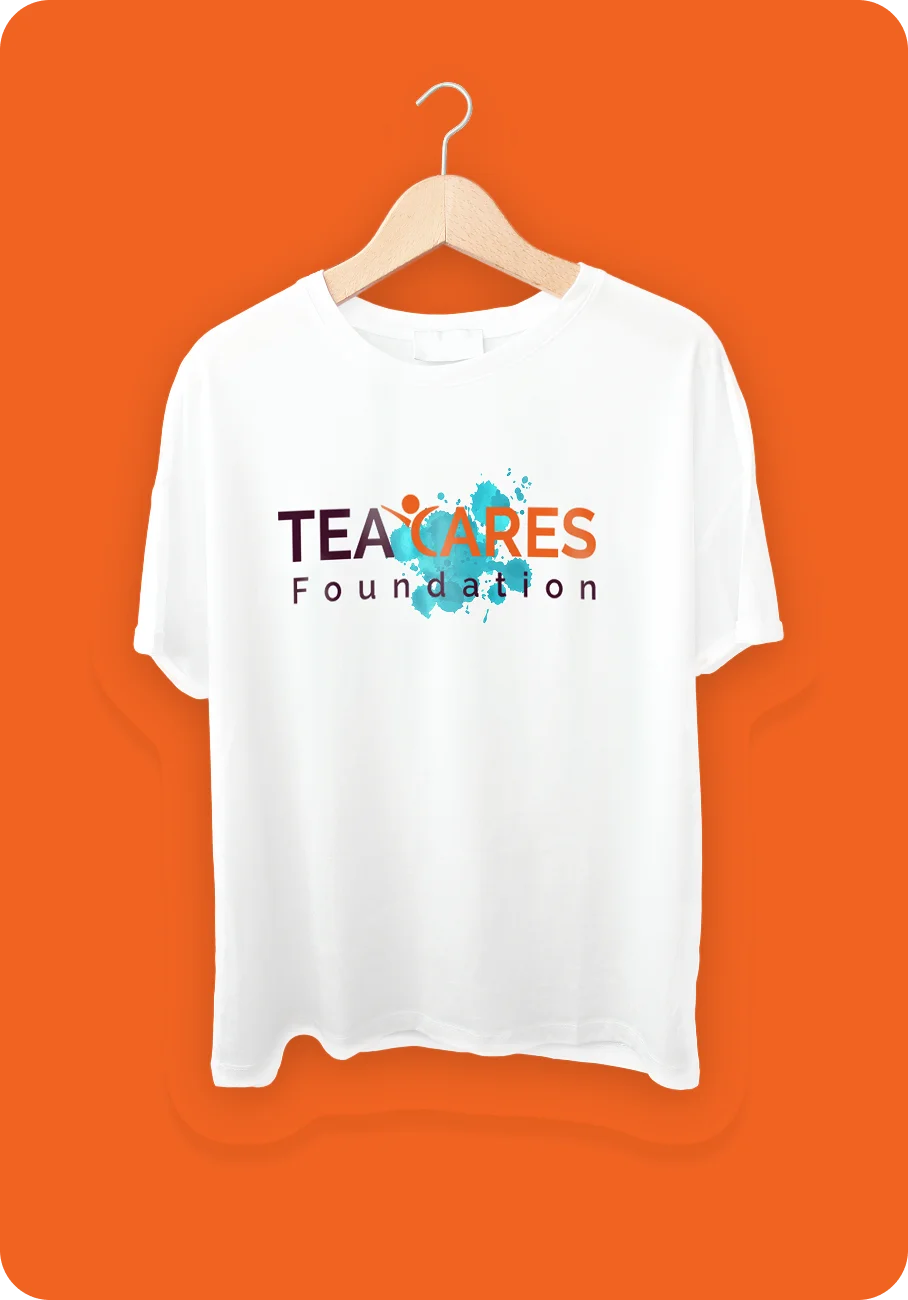
TeaCares Foundation Visual Identity Design by Design Agency CGAlive
Logo Mockups, Color Palette, and Typography Showcasing the Brand’s
Warmth and Purpose


More Professional Logo Design Case Studies & Brand Identity Projects
Curated Collection of Case Studies Highlighting Creativity, Precision, and Purpose in Brand Identity Design.Entity
Hema Agrotech logo
Hema Agrotech — Nurturing Growth, Naturally
Roboto 360 logo
Roboto 360 — Humanizing Automation
Woodie Woodie logo
Woodie Woodie — Strength with Wisdom
CREATE A BRAND THAT LASTS
From Brand Logo To Identity, We Design It
With A Great Story
Unique, memorable logo and brand design that leaves a lasting impression.


