Trikona brand Logo Design Case Study
Trikona Pharma — A Symbol of Growth and Balance in Healthcare Design
Designing a Meaningful Identity for Trikona Pharma
How Nature, Geometry, & Color Came Together to Define a Modern Pharma Brand
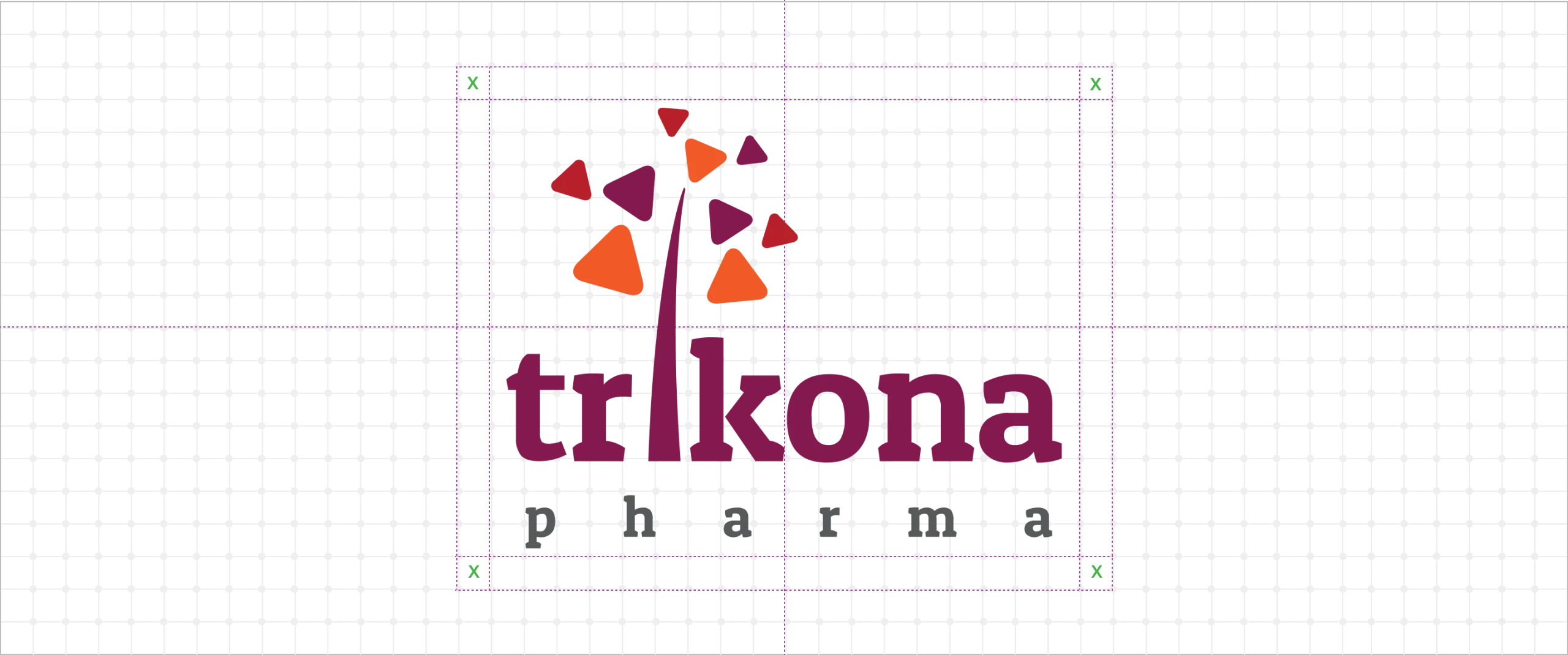
Trikona Pharma, a forward-looking pharmaceutical brand, wanted a logo that visually reflects its name — “Trikona,” meaning triangle — a symbol of stability, balance, and strength. The challenge was to merge this geometric meaning with a sense of natural growth and wellness that defines the healthcare industry.
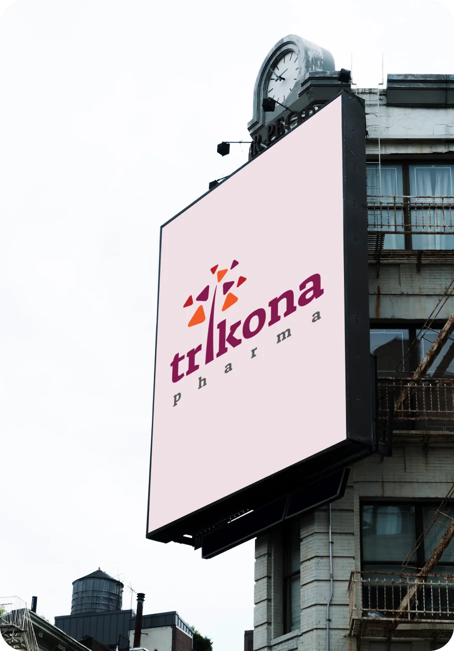
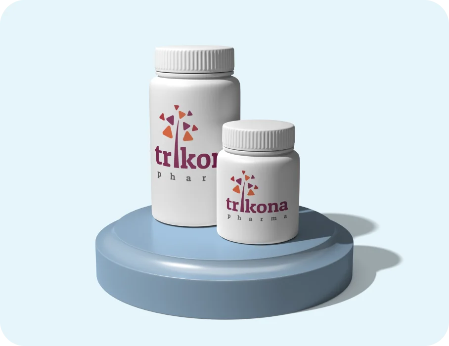
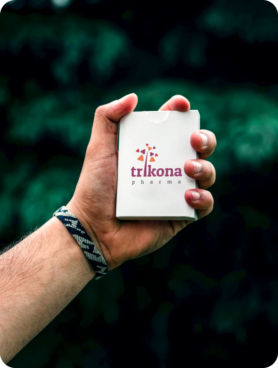
The logo features a tree sprouting from the letter “I”, with each leaf shaped like a rounded triangle in shades of orange. This symbolizes vitality, healing, and continuous progress. The vibrant palette adds warmth and optimism, while the simple typography ensures clarity and trust.
The result is a distinctive brand mark that connects nature, science, and meaning — representing Trikona Pharma’s vision of balanced innovation in modern healthcare.
Your Brand Logo Journey starts here Get started →
Trikona Pharma — A Symbol of Growth, Balance, and Innovation
A bright, organic logo featuring a tree of triangular leaves, embodying health, vitality, and scientific progress.
Trikona Pharma Brand Identity Design by Design Agency CGAlive
Exploring Logo Mockups, Color Palette, & Typography That Bring the Brand to Life

More Professional Logo Design Case Studies & Brand Identity Projects
Curated Collection of Case Studies Highlighting Creativity, Precision, and Purpose in Brand Identity Design.Entity
Hema Agrotech logo
Hema Agrotech — Nurturing Growth, Naturally
Roboto 360 logo
Roboto 360 — Humanizing Automation
Woodie Woodie logo
Woodie Woodie — Strength with Wisdom
CREATE A BRAND THAT LASTS
From Brand Logo To Identity, We Design It
With A Great Story
Unique, memorable logo and brand design that leaves a lasting impression.


