Vijaya PH logo design case study · Healthcare
Forty Years of Trust.
One New Mark.
Two legacies came together. The logo had to carry both.
How we redesigned the identity of Vijaya PH Diagnostic Center after its merger with pH Diagnostic Center, keeping four decades of recognition while looking firmly forward.

V + ✓ · Clear space = x
#2E3192
Client
Vijaya PH Diagnostic Center
Industry
Healthcare · Diagnostics
Deliverables
Logo redesign · Colour · Type · Brand applications
Project
Redesign after merger
The brief
Two trusted names. One identity that feels like both.
Vijaya Diagnostic Center has served patients for over 40 years. When it merged with pH Diagnostic Center, the combined brand needed one symbol that long-time patients would still recognise and new patients would see as modern. In healthcare, a logo has to say accuracy and trust before anything else.
The Challenge
- Two brands, each with its own loyal patients and history
- A category full of generic crosses, hearts and stethoscopes
- Patients judge a lab on trust long before they see a report
What Success Looked Like
- Feels familiar to 40 years of patients
- Signals precision and accuracy at a glance
- Looks modern beside national diagnostic chains
- Works on reports, signage and sample labels
Why it matters
In Healthcare, Trust is the Brand.
Patients choose a diagnostic center on trust. The logo appears on every report, sample tube, receipt and signboard, often small and often in one colour. It has to feel credible instantly and stay consistent across every branch and every document. That takes more than a quick redraw.
01sec
First Impression
All the time a patient gives a lab to decide if it feels reliable.
16px
Still Readable
From a hospital signboard down to a browser tab.
01colour
Still Yours
On reports, stamps and sample labels.
40+yrs
Legacy Carried Forward
Four decades of trust, kept recognisable in the new mark.
From brief to brand
Two Legacies. One Clear Symbol.
Discover
We met both teams to understand what each brand meant to its patients and doctors. Four words became the filter for every idea: trusted, precise, modern and caring.
Research
We reviewed diagnostic and healthcare brands, local and national. Most relied on crosses, hearts and DNA strands, which made them hard to tell apart.
Sketch
Explorations around the letter V, checkmarks, shields, gems and lab motifs, looking for one shape that could hold both legacies.
Explore
Directions were tested on reports, signage and favicons side by side. A V that doubles as a checkmark said “accurate” and “Vijaya” in one move.
Refine
We cut the V into diamond facets for a premium, precise feel, and balanced indigo and red so the mark felt clinical but warm.
Deliver
Master logo, versions for reports and signage, colour and type system, and organised files for print, digital and every branch.
Behind the scenes
The Ones That Didn’t Make It
Good ideas get cut too. Here’s what we set aside, and why.
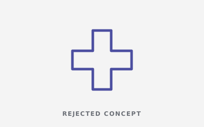
The Medical Cross
Universally understood, but used by almost every clinic and lab.
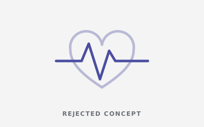
The Heartbeat Line
Caring, but it read as cardiology, not diagnostics.
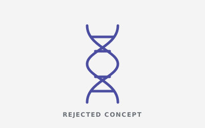
The DNA Helix
Scientific, but cold, and too narrow for a full diagnostic center.
Every detail has a job
Every Facet Carries Meaning
1
The Letter V
The first letter of Vijaya, kept at the heart of the mark so long-time patients still recognise their lab.
2
The Checkmark
The V doubles as a tick: the universal sign for a correct, verified result.
3
Diamond Cut
Faceted edges add precision and value, a quiet signal of accuracy and premium care.
4
Indigo + Red
Indigo for trust and clinical calm. Red for care and the warmth of the original brand.
Construction & rules
Built on Rules, Not Guesswork.
Clear rules keep the identity consistent across every branch, report template, signboard and new partner.
Construction Grid
The facets are built on a consistent angle system, so the V stays sharp and balanced at every size.
xxxxClear Space
Keep a margin of x (the height of the “V”) on every side. Nothing enters this zone.
48px32px24px minMinimum Size
24px on screen and 15mm in print. Below that, use the symbol on its own.
Stress tests
Tested in the Real World Before Launch.
A logo that only works on a big white screen isn’t finished. We put Vijaya PH Diagnostic Center through the places it actually lives before the client ever did.
Vijaya PH · Diagnostics16px Favicon
The V-checkmark still reads in a crowded row of browser tabs.
App & Social Icon
The symbol alone stands out on a phone screen or as a profile picture.
One Colour
Works on reports, stamps and single-colour sample labels.
Reversed
Holds up on dark signage and backgrounds.

On Photography
Stays readable on busy, real-world images.
Hover to sharpenSquint Test
Still recognisable when blurred, the classic memorability check.
Brand identity system
One Identity. Every Place it Shows up
Indigo
#2E3192
Vijaya Red
#E31E24
Deep Indigo
#1B1F5E
Soft Indigo
#C9CCF0
Clinical White
#F5F6FA


Primary Typeface
A clean, sturdy sans with clear numerals: readable on dense reports and confident on signage.


The result
What the New Identity Delivers
1
Unified identity for two merged diagnostic centers.
40+
Years of recognition carried into a modern mark.
✓
A symbol that says “accurate result” at a glance.