Guidizy logo design case study · Tech Assistance
Expert Help.
Made Easy.
Guide Easy: the right advice before you buy
How we gave Guidizy, a platform connecting shoppers with product experts for high-value electronics, a mark that says clarity, connection and trust.

Expert + user · Clear space = x
#1565D8
Client
Guidizy
Industry
Consumer Tech · Expert Advice
Deliverables
Logo · Colour · Type · Brand applications
Project
New brand identity
The brief
Show the human conversation behind every smart purchase.
Guidizy, short for “Guide Easy”, connects people with qualified experts while they buy high-value electronics. Its logo had to communicate clarity, connection and trust, so shoppers feel they are talking to a real person who knows the product.
The Challenge
- Chat and support brands all use the same speech bubble
- Had to feel human, not like a bot or call centre
- Two roles to show: the expert and the shopper
What Success Looked Like
- Shows a real conversation at a glance
- Feels trustworthy and approachable
- Makes the expert feel reliable
- Works in the app, on web and on social
Why it matters
When Advice is the Product, Trust is Everything.
Guidizy users are about to spend serious money and want honest advice. The logo appears in app stores, chat screens, ads and social feeds, usually small and next to big retail brands. It has to look reliable and friendly in a split second.
01sec
First Impression
All the time a shopper gives an app before deciding to ask for help.
16px
Still Readable
From a billboard down to a browser tab.
01colour
Still Yours
On stickers, receipts and one-colour print.
10+yrs
Still Relevant
Designed to grow with the brand, not chase trends.
From brief to brand
Two People. One Conversation. One Mark.
Discover
We worked with the founders to understand the moment Guidizy helps with: a big purchase and a need for honest advice. Four words guided every idea: clear, connected, trusted and easy.
Research
We reviewed support, chat and marketplace brands. Most used a plain speech bubble or a headset, which felt generic or robotic.
Sketch
Explorations of people, conversations, compasses and guides, looking for a way to show two humans connecting.
Explore
Directions tested in app stores, chat screens and favicons. An expert in a circle and a user with speech lines told the story clearly.
Refine
We simplified both silhouettes, set the expert in a reliable blue circle, and gave the speech lines magenta, yellow and white for diverse advice.
Deliver
Master logo, symbol and wordmark versions, colour and type system, and files ready for app, web, social and print.
Behind the scenes
The Ones That Didn’t Make It
Good ideas get cut too. Here’s what we set aside, and why.
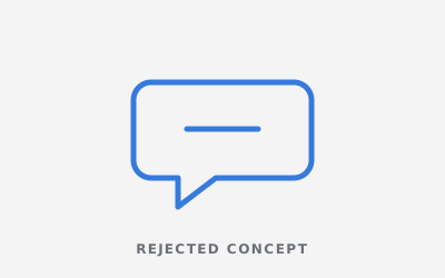
The Speech Bubble
Clear, but every chat app uses one.
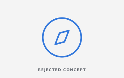
The Compass
Guidance, but it read as travel or maps.
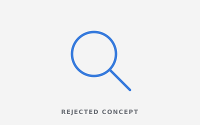
The Magnifier
Search, but it felt like a shopping site.
Every detail has a job
Every Element Carries Meaning
1
The Expert
A silhouette inside a blue circle: reliability and tech confidence.
2
The User
The shopper, drawn just as simply, so the relationship feels equal and human.
3
Speech Lines
Magenta, yellow and white lines for interaction, communication and diverse advice.
4
The Wordmark
Modern lettering that reinforces accessibility and digital simplicity.
Construction & rules
Built on Rules, Not Guesswork.
Clear rules keep the identity consistent across the app, website, social media, ads and partner stores.
Construction Grid
Both figures sit on a shared circular grid, so the conversation stays balanced at every size.
xxxxClear Space
Keep a margin of x (the height of the “G”) on every side. Nothing enters this zone.
48px32px24px minMinimum Size
24px on screen and 15mm in print. Below that, use the symbol on its own.
Stress tests
Tested in the Real World Before Launch.
A logo that only works on a big white screen isn’t finished. We put Guidizy through the places it actually lives before the client ever did.
Guidizy · Ask an expert16px Favicon
The expert circle still reads in a crowded row of browser tabs.
App & Social Icon
The symbol stands out in an app grid or as a profile picture.
One Colour
Works on stickers, receipts and single-colour print.
Reversed
Holds up on dark screens and backgrounds.

On Photography
Stays readable on busy, real-world images.
Hover to sharpenSquint Test
Still recognisable when blurred, the classic memorability check.
Brand identity system
One Identity. Every Place it Shows up
Guide Blue
#1565D8
Magenta
#D6247F
Sunny Yellow
#FFC93C
Navy
#0B1F44
White
#FFFFFF


Primary Typeface
A modern, friendly sans that feels accessible in the app and clear in ads.


The result
What the New Identity Delivers
2
Expert and shopper, connected by conversation.
3
Speech lines in magenta, yellow and white for diverse advice.
1
A circle of reliability around the expert.
Logo health check
Is Your Logo Pulling Its Weight?
Five questions we ask of every logo, including yours. Answer honestly.
Let’s shape your brand story
Ready for a logo that actually sells your brand?
Select your starting point below to customise your project, or skip the form and talk directly to our lead designer.
Starting from scratch
Create a New Logo
Ideal for launching new businesses, startups, or products that need a distinct identity from day one.
Suggested for you
Refresh Existing Logo
Modernize your current design so it aligns with where your business is heading today.
Complete package
Full Brand Identity System
Everything you need: logo, typography, color palette, app icons, and merchandise guidelines.
Prefer a quick chat instead? Book a free 15-minute brand audit →
- ⚡Fast response: Reply within 24 hours
- 🏆Proven track record: 400+ projects completed
- 🔒100% Private: No spam or shared details