IC-IT logo design case study · Technology
No Icon Needed.
Just Clarity.
A timeless wordmark for a technology company
How we gave IC-IT, a technology solutions company, a custom wordmark that expresses intelligence, clarity and professionalism without any complex graphics.

Custom wordmark · Clear space = x
#14294F
Client
IC-IT
Industry
Technology Solutions
Deliverables
Logo · Colour · Type · Brand applications
Project
New brand identity
The brief
Say “intelligent and professional” with letters alone.
IC-IT provides technology solutions to businesses. It wanted a timeless wordmark that reflects intelligence, clarity and professionalism, with no reliance on complex symbols, so the name itself becomes the brand.
The Challenge
- A short name made of capital letters and a hyphen
- IT logos often hide behind circuits and globes
- A wordmark has nowhere to hide: every detail shows
What Success Looked Like
- Reads clearly and confidently
- Feels intelligent and professional
- Timeless, not trend-driven
- Works on proposals, products and signage
Why it matters
A Wordmark Has to Be Perfect.
Without a symbol, the letters carry the entire brand. Every curve, angle and space is visible on proposals, email signatures, product screens and signage. Small decisions make the difference between generic type and an identity that feels intelligent and owned.
01sec
First Impression
All the time a client gives a proposal’s cover to judge the company.
16px
Still Readable
From an office sign down to a browser tab.
01colour
Still Yours
On letterheads, badges and one-colour print.
10+yrs
Still Relevant
Designed to grow with the brand, not chase trends.
From brief to brand
Four Letters. Every Detail Intentional.
Discover
We worked with the team to understand how IC-IT wants clients to see it. Four words guided every decision: intelligent, clear, professional and timeless.
Research
We reviewed IT and technology brands. Many relied on circuits, globes and swooshes that added noise instead of meaning.
Sketch
We explored symbols and monograms first, then letter studies, to test whether the name alone could carry the brand.
Explore
Directions tested on proposals, email signatures and favicons. A custom wordmark proved clearest and most ownable.
Refine
We balanced sharp and rounded edges to add warmth to technical precision, and tuned every curve and space with intent.
Deliver
Master wordmark, compact IC version, colour and type system, and files ready for proposals, products, web and signage.
Behind the scenes
The Ones That Didn’t Make It
Good ideas get cut too. Here’s what we set aside, and why.
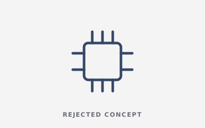
The Circuit Symbol
Technical, but the most common IT cliché.
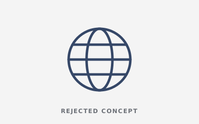
The Globe
Global, but generic and forgettable.
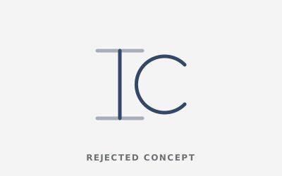
The IC Monogram
Neat, but hard to read without the full name.
Every detail has a job
Every Letter Carries Meaning
1
Custom Letterforms
Clean, structured letters drawn for IC-IT, not typed from a standard font.
2
Sharp + Rounded Edges
Crisp angles for precision, softened corners for a human touch.
3
Intentional Spacing
Every gap is tuned so the name reads as one confident unit.
4
Navy + Grey
Navy for trust and stability. Grey for a modern, understated balance.
Construction & rules
Built on Rules, Not Guesswork.
Clear rules keep the wordmark consistent across proposals, products, presentations and office signage.
Construction Grid
All letters share one cap height, stroke weight and corner radius, so the wordmark stays balanced at every size.
xxxxClear Space
Keep a margin of x (the height of the “I”) on every side. Nothing enters this zone.
48px32px24px minMinimum Size
24px on screen and 15mm in print. Below that, use the symbol on its own.
Stress tests
Tested in the Real World Before Launch.
A logo that only works on a big white screen isn’t finished. We put IC-IT through the places it actually lives before the client ever did.
IC-IT · Technology Solutions16px Favicon
The compact IC version stays readable in a browser tab.
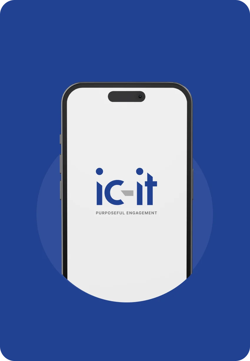
App & Social Icon
The compact version stands out as an app icon or profile picture.
One Colour
Works on letterheads, badges and single-colour print.
Reversed
Holds up on dark slides and screens.
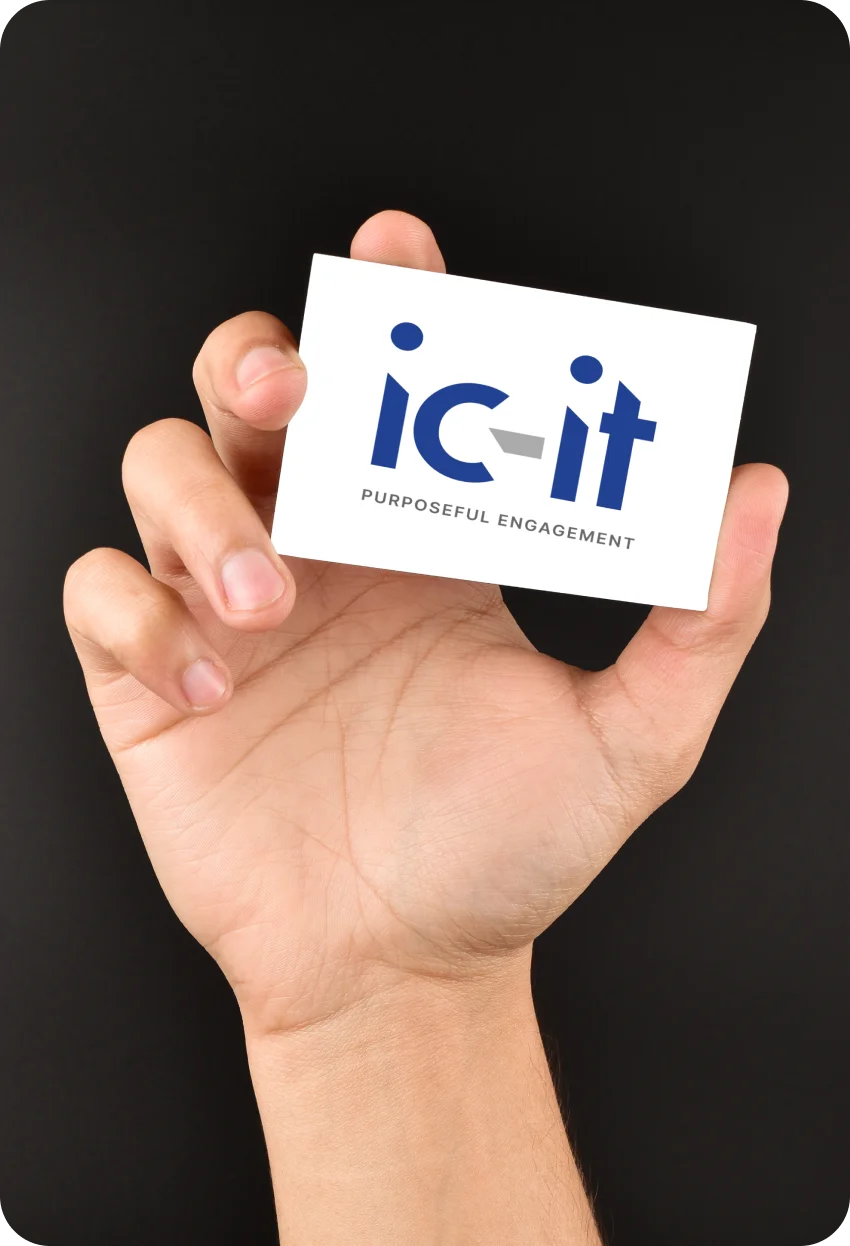
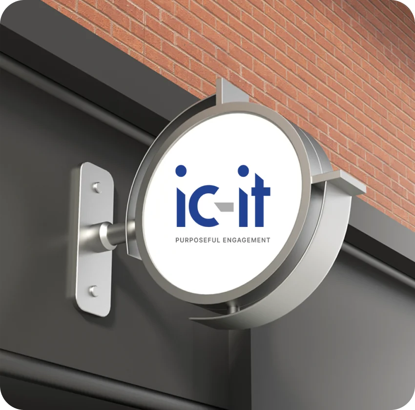
On Photography
Stays readable on busy, real-world images.
Hover to sharpenSquint Test
Still recognisable when blurred, the classic memorability check.
Brand identity system
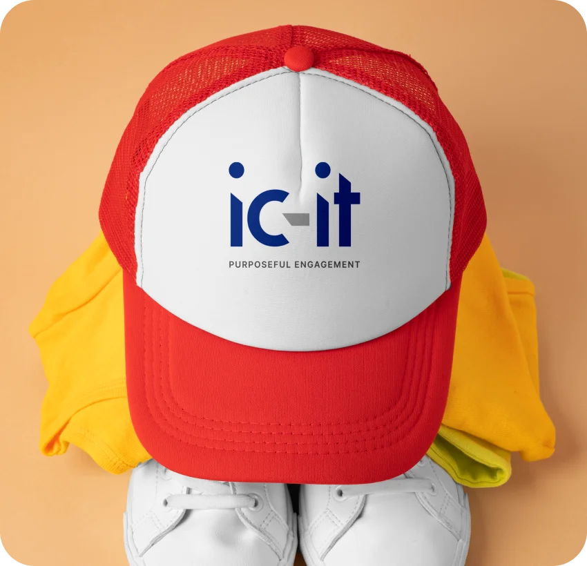
One Identity. Every Place it Shows up
IC Navy
#14294F
Slate Grey
#6B7480
Midnight
#0A1630
Silver
#C9CED6
Fog
#F3F5F8
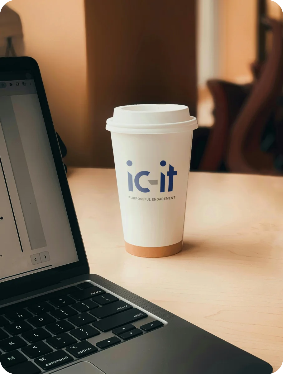
Primary Typeface
A custom wordmark drawn with structured letterforms, paired with a clean sans for supporting text.

The result
What the New Identity Delivers
0
No symbol needed: the letters do the work.
2
Sharp and rounded edges balance precision and warmth.
1
Timeless wordmark built to last.
Logo health check
Is Your Logo Pulling Its Weight?
Five questions we ask of every logo, including yours. Answer honestly.
Let’s shape your brand story
Ready for a logo that actually sells your brand?
Select your starting point below to customise your project, or skip the form and talk directly to our lead designer.
Starting from scratch
Create a New Logo
Ideal for launching new businesses, startups, or products that need a distinct identity from day one.
Suggested for you
Refresh Existing Logo
Modernize your current design so it aligns with where your business is heading today.
Complete package
Full Brand Identity System
Everything you need: logo, typography, color palette, app icons, and merchandise guidelines.
Prefer a quick chat instead? Book a free 15-minute brand audit →
- ⚡Fast response: Reply within 24 hours
- 🏆Proven track record: 400+ projects completed
- 🔒100% Private: No spam or shared details